Filter
428
Text search:
interactive
map
Featured
50
112
Language
Document type
213
79
38
34
20
17
9
5
4
4
3
1
1
Countries / Regions
25
15
14
13
10
10
9
8
8
8
7
7
6
6
6
5
5
5
5
4
4
4
4
3
3
3
3
3
3
3
3
3
3
2
2
2
2
2
2
2
2
2
2
2
2
2
2
2
2
2
1
1
1
1
1
1
1
1
1
1
1
1
1
1
1
1
1
1
1
1
1
1
1
1
Authors & Publishers
Publication Years
Category
127
47
33
21
20
15
2
Toolboxes
35
32
32
23
16
15
12
11
11
10
9
9
9
8
7
7
7
6
4
3
3
3
2
2
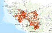
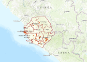
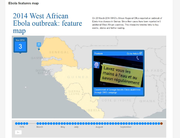
Tracking the Ebola Outbreak (interactive map)
recommended
Interactive Map, please click on: website link:
https://devseed-dev.firebaseapp.com/
Now available in an interactive map journal that shows the evolution of the outbreak and the global response. Please download the latest version from the website
http://apps.who.int/ebola/en/curr
...
John Hopkins COVID-19 map
recommended
Interactive Map
You’ve probably noticed that the map has been evolving along with the virus. Now, it sports new layers of data—including a clo
...
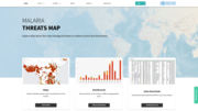
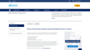
The WHO Malaria Threats Map is an interactive online platform that showcases the latest global data on four critical biological threats to effective malaria control and elimination: mosquito insecti
...
Accessed on 06.03.2022
This interactive tool provides a snapshot – in the form of a map – of current national air quality standards for classical pollutants (particulate matter, nitrogen d
...
Available in English, French an Spanish. The Malaria Threats Map is an interactive data platform which provides a geographic overview of the status of the 4 biological threats to malaria control and
...
On 23 March 2014 WHO’s African Regional Office reported an outbreak of Ebola virus disease in Guinea. Since then cases have been reported in 5 additional West African countries. This interactive timeline links to key events, stories and further re
...
Interactive Map
Interactive map
interactive map, please follow the link below to use the map functions
updated 31 March 2016
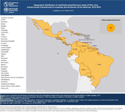
http://ais.paho.org/phip/viz/ed_zika_countrymap.as
...
This interactive map of Africa tracks reported cases of Ebola and the number of deaths. The map will be updated every few days as new data become a
...
This interactive map shows polio cases and disease surveillance indicators worldwide within the desired timeframe and available data, as well as environmental samples in endemic countries.
Find o
...
WHO Coronavirus Disease (COVID-19) Dashboard
recommended
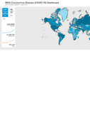
This interactive dashboard/map provides the latest global numbers and numbers by country of COVID-19 cases on a daily basis.
WHO/AFRO Ebola DRC Surveillance Dashboard
recommended
Interactive site with case data and a map of locations affected
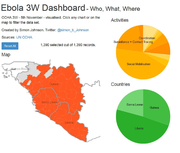
Please find the latest interactive infographic on the websitehttp://www.humanitarianresponse.info/fr/operations/west-and-central-africa/infographies-interactives. Click any chart or on the map to f
...
